
統計ソフトRのグラフ上に数値を表示させたり、軸の目盛間隔や軸ラベルを変更する方法を紹介。

軸の数値をすべて縦にする
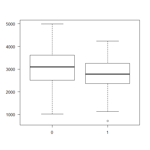
las=1
軸ラベルのスタイル(the style of axis labels)。1は縦軸も横軸も縦方向の数字にする意味。
例:
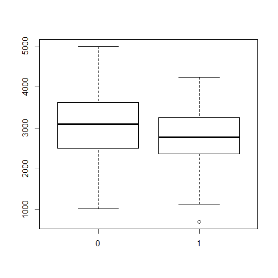
library(MASS)
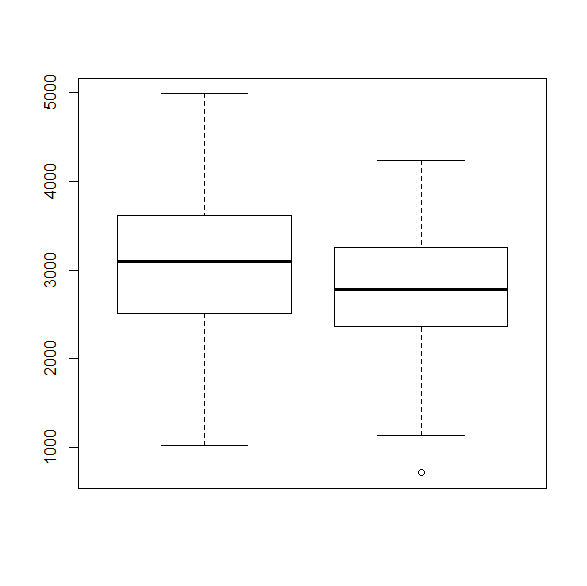
boxplot(bwt~smoke,data=birthwt)
boxplot(bwt~smoke,las=1,data=birthwt)
縦軸の数字が縦向きに変わる。
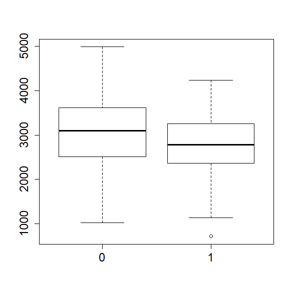
軸の数字を大きくする
cex.axis=
軸(AXIS)の文字拡大(Character EXpansion)。デフォルト(指定しないとき)は1。2にするととても大きくなる。1.5などの小数点以下も使える。
boxplot(bwt~smoke,cex.axis=1.5,data=birthwt)

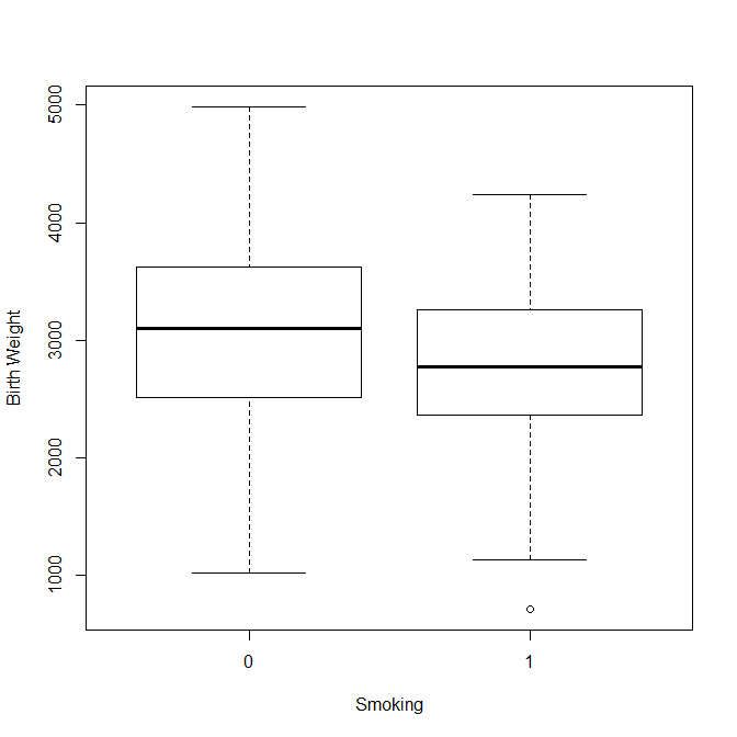
軸のラベルを変更する
X軸、Y軸のラベルを変更したいときは、以下のオプションを使う。
xlab="Label of X Asis"
ylab="Label of Y Axis"
例は以下の通り。
boxplot(bwt~smoke, data=birthwt, xlab="Smoking", ylab="Birth Weight")
軸の値ラベルを消す
xaxt="n"
yaxt="n"
X軸またはY軸のタイプ(X or Y AXis Type)を指定する。”n”は、表示させなくする指示。値ラベルを付け直したいときに有用。
例:
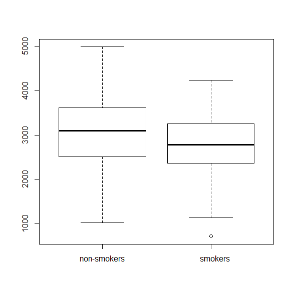
boxplot(bwt~smoke,xaxt="n",data=birthwt)
軸の値にラベルをつける
axis(1, at=, formatC())
axis(2, at=, formatC())
X軸(1がX軸、2がY軸)のatの位置にformatCのラベルをつける。
boxplot(bwt~smoke,xaxt="n",data=birthwt)
axis(1,at=c(1,2),formatC(c("non-smokers","smokers")))
軸の目盛りを変える
Y軸の目盛りを変えたいとき。
yaxp=c(最初,最後,区間数)
X軸の場合はxaxp=c()
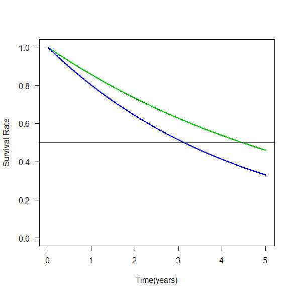
r3 <- 0.144
r4 <- 0.199
x <- seq (0:500) / 100
y3 <- (1-r3)^x
y4 <- (1-r4)^x
plot(x,y3,ylim=c(0,1),las=1,xlab="Time(years)",ylab="Survival Rate",type="l",lwd=2,col=3)
lines(x,y4,lwd=2,col=4)
abline(h=0.5)
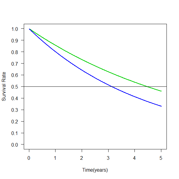
Y軸のメモリを0.1刻みに変更したい場合、以下のとおり。
plot(x,y3,ylim=c(0,1),las=1,xlab="Time(years)",ylab="Survival Rate",type="l",lwd=2,col=3,yaxp=c(0,1,10))
lines(x,y4,lwd=2,col=4)
abline(h=0.5)
参考サイト
http://tips-r.blogspot.jp/2014/09/r.html
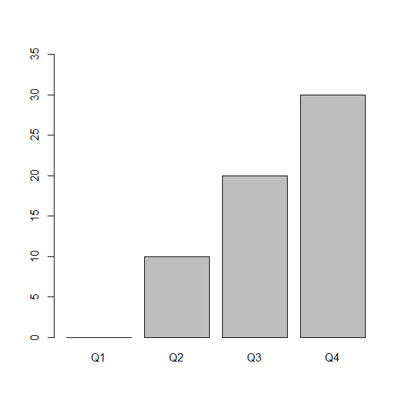
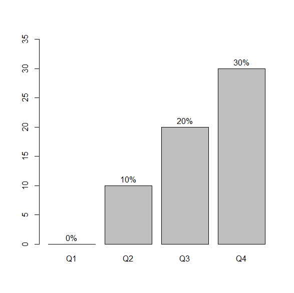
棒グラフに割合の値を書き入れる
割合を棒グラフ(barplot)にする。Y軸の範囲を0%から35%までにしておく。
tab <- matrix(c(1000,900,800,700,0,100,200,300),nr=4)
colnames(tab) <- c("no","yes")
rownames(tab) <- c(paste("Q",1:4,sep=""))
tab.prop <- (prop.table(tab,1)*100)[,2]
barp <- barplot(tab.prop, ylim=c(0,35))
割合の値を貼り付ける。X座標がbarp(棒の中心のX座標)、Y座標がtab.prop(割合の値)、そこに割合+”%”を貼り付ける。adj=c(0.5,-0.5)で位置を調整。
text(barp, tab.prop, paste(tab.prop,"%",sep=""), adj=c(0.5,-0.5))
参考書籍
中澤港著 Rによる保健医療データ解析演習 ピアソンエデュケーション
2.7.1 度数分布図 p.21
")
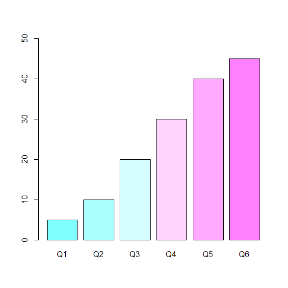
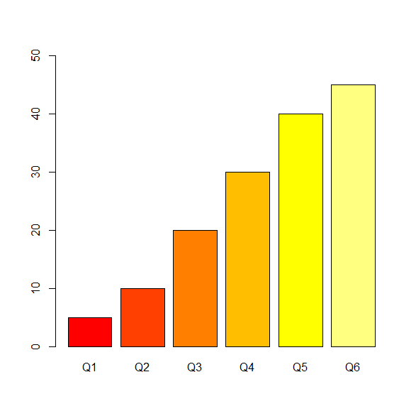
棒グラフに色をつける
col= を使う。
tab <- matrix(c(950,900,800,700,600,550,50,100,200,300,400,450),nr=6)
colnames(tab) <- c("no","yes")
rownames(tab) <- c(paste("Q",1:6,sep=""))
tab.prop <- (prop.table(tab,1)*100)[,2]
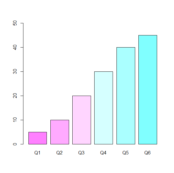
シアン・マゼンタ cyan-magentaでcm
Low riskからhigh riskって感じが出る。
barplot(tab.prop, ylim=c(0,50), col=cm.colors(6))
棒が6本でないときは,( )内の数字を本数にあわせて変える。
まさに熱のheat color
barplot(tab.prop, ylim=c(0,50), col=heat.colors(6))
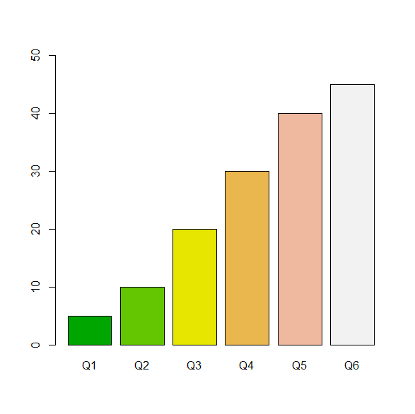
地形(terrain)用の配色
barplot(tab.prop, ylim=c(0,50), col=terrain.colors(6))
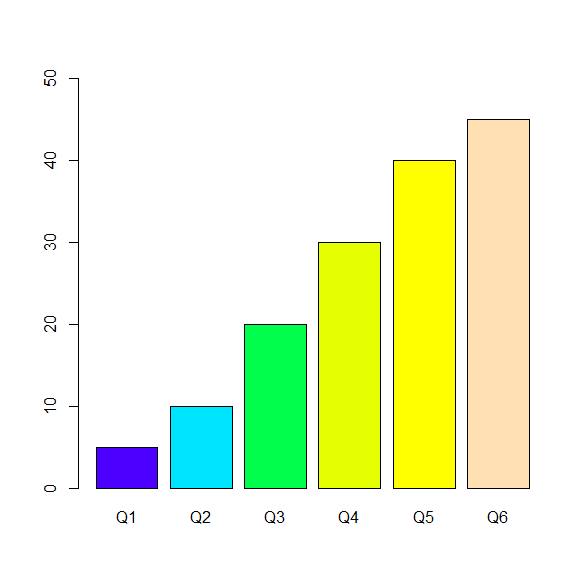
地形学(topography)用の配色
barplot(tab.prop, ylim=c(0,50), col=topo.colors(6))
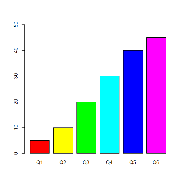
虹色 rainbow
barplot(tab.prop, ylim=c(0,50), col=rainbow(6))
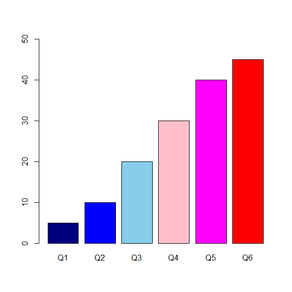
好きな色の指定もできる
barplot(tab.prop, ylim=c(0,50), col=c("navyblue","blue","skyblue","pink","magenta","red"))
The R-tipsは,本当にすごい本。
ひとつひとつの記述は簡潔だが、
何でも書いてある。
特にグラフィックスに関しては網羅されていいる。
参考書籍

カラーパターンを逆向きにしたい!
rev() を使う。
barplot(tab.prop, ylim=c(0,50), col=rev(cm.colors(6)))
barplot(tab.prop, ylim=c(0,50), col=rev(heat.colors(6)))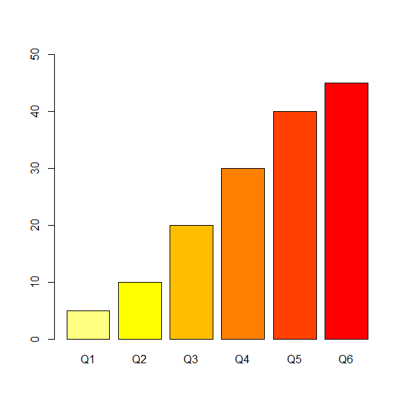
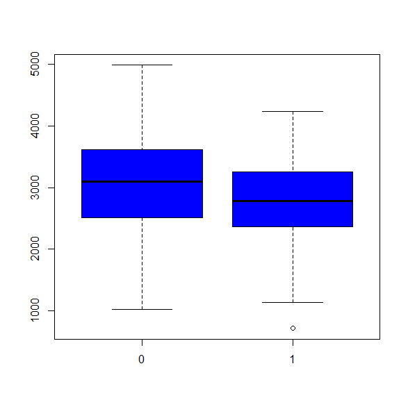
箱ひげ図の箱部分に色をつける
例:ボックスを青で塗る。
boxplot(bwt~smoke,col="blue",data=birthwt)
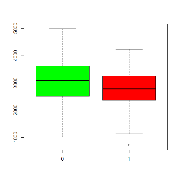
塗り分けたいときはc()で列挙。
boxplot(bwt~smoke,col=c("green","red"),data=birthwt)
まとめ
統計ソフトRでグラフを描いた時の調整方法を紹介した。
ちょっとしたことなんだけど、
どうやったらいいの?という方法を集めてみた。
お役に立てば幸い。


コメント