
Rでヒストグラムと箱ひげ図をggplot2 を使って重ねて描く方法の紹介。

目次
Rでヒストグラムをggplot2 を使って描く方法
Rでヒストグラムをggplot2を使って描く方法を紹介する。
まずggplot2 パッケージをインストールして、呼び出しておく。
install.packages("ggplot2")
library(ggplot2)
次にヒストグラムを描くデータを準備する。
今回は pROC パッケージの aSAH データセットを使用する。
aSAH データセットの中の age のヒストグラムを描くことにする。
pROC パッケージをインストールして、呼び出す。
install.packages("pROC")
library(pROC)
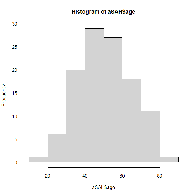
通常のヒストグラムはこんな感じになる。
hist(aSAH$age)
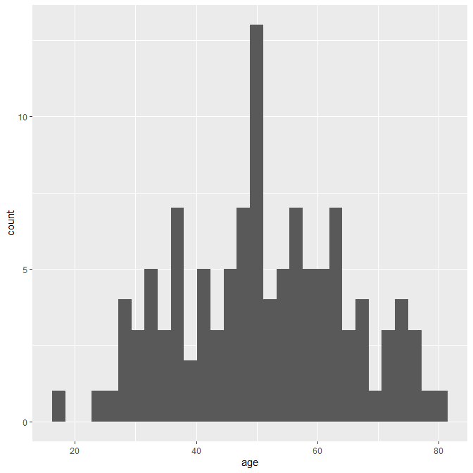
ggplot2で描くとこんなかっこいい感じに描ける。
ggplot(aSAH, aes(x=age)) + geom_histograpm()
Rで箱ひげ図をggplot2 を使って描く方法
Rで箱ひげ図を ggplot2 を使って描く方法を紹介する。
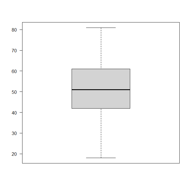
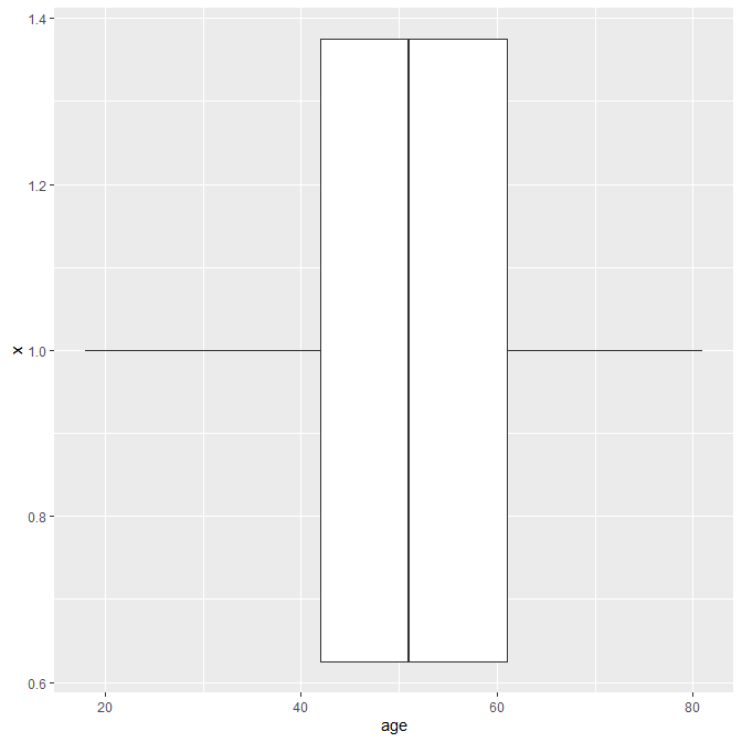
通常の箱ひげ図は、こんな感じになる。
boxplot(aSAH$age)
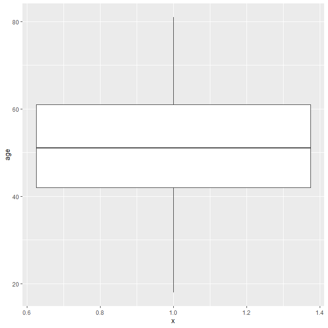
ggplot2 を使って描くとこういうふうになる。
ggplot(aSAH, aes(x=1, y=age)) + geom_boxplot()
これを横にすることができる。
ggplot(aSAH, aes(x=1, y=age)) + geom_boxplot() + coord_flip()

Rでヒストグラムと箱ひげ図を ggplot2 で重ねて描く方法
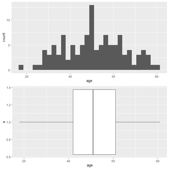
上記のヒストグラムにHist1という名前を付けて、箱ひげ図には Box1 という名前を付けて、上下に並べて描くスクリプトを示す。
Hist1 <- ggplot(aSAH, aes(x=age))+
geom_histogram()
Box1 <- ggplot(aSAH, aes(x=1, y=age))+
geom_boxplot()+
coord_flip()
grid.arrange(Hist1, Box1, ncol=1, nrow=2)
grid.arrange() というのが並べる関数で、ncol=が列のグラフ枠の数、nrow=が行のグラフ枠の数である。
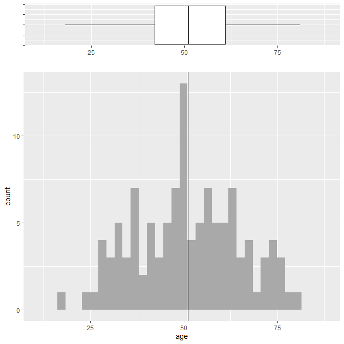
すると以下のような図が描ける。
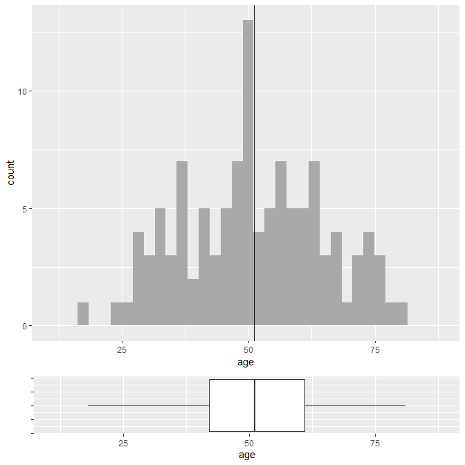
ここからもう少しきれいにしていく。
スクリプト内に注釈を入れて、どの行が何をしているのかわかるようにしておく。
x <- aSAH$age
Mean <- mean(x)
Lim <- c(min(x)-sd(x)/2, max(x)+sd(x)/2) #X軸の最小最大の設定
Hist2 <- ggplot(aSAH, aes(x=age))+
geom_histogram(fill = "darkgray")+ #ヒストグラムを薄いグレーで塗る
geom_vline(xintercept = Mean, color="black")+ #平均値の位置に縦の線を黒で描く
coord_cartesian(xlim = Lim) #X軸の設定をここで反映
Box2 <- ggplot(aSAH, aes(x=1, y=age))+
geom_boxplot()+
coord_flip(ylim = Lim)+ #グラフを横にしているので横軸のY軸の設定
theme(axis.text.y = element_text(color="white"))+ #横にした後の縦方向の軸の文字を白にして非表示に
labs(x="") #縦方向の軸のラベルを非表示に
grid.arrange(Hist2, Box2, ncol=1, nrow=2, heights=c(4,1)) #heights で下の部分の高さを1/4に
実行するとこんなグラフになる。
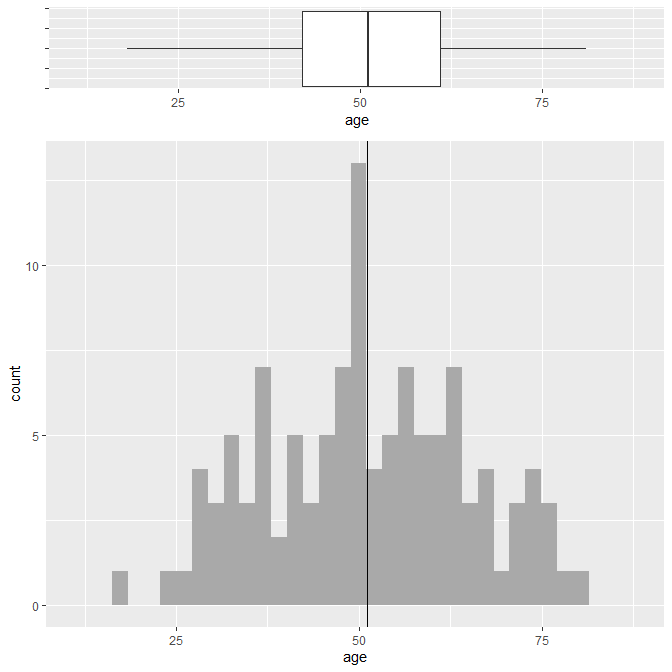
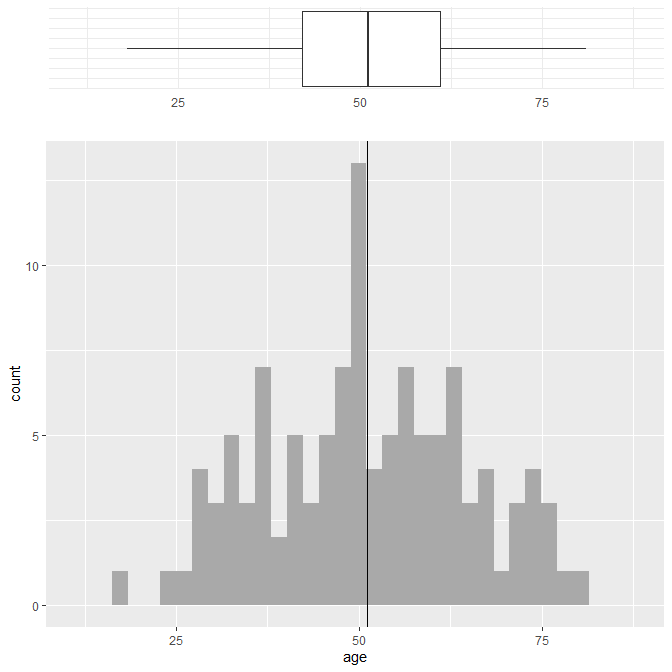
上下を入れ替えるとこんなふうになる。
grid.arrange(Box2, Hist2, ncol=1, nrow=2, heights=c(1,4))
箱ひげ図のラベルを消すともっと見栄えがいいかもしれない。
Box2 <- ggplot(aSAH, aes(x=1, y=age))+
geom_boxplot()+
coord_flip(ylim = Lim)+
theme(axis.text.y = element_text(color="white"))+
labs(x="", y="") # y="" を追加
grid.arrange(Box2, Hist2, ncol=1, nrow=2, heights=c(1,4))
箱ひげ図に theme_minimal() を適用するとシンプルでみやすくなる。
Box2 <- ggplot(aSAH, aes(x=1, y=age))+
geom_boxplot()+
coord_flip(ylim = Lim)+
theme_minimal()+ #この行を追加
theme(axis.text.y = element_text(color="white"))+
labs(x="", y="")
grid.arrange(Box2, Hist2, ncol=1, nrow=2, heights=c(1,4))
まとめ
Rでヒストグラムと箱ひげ図を重ねる方法を、ggplot2を使って紹介した。
何らか役に立てば幸い。


コメント